Live in Columbus and want to see the new place? Come to our open house next Saturday, July 13 from 3-5 pm. More details on the Facebook invite.
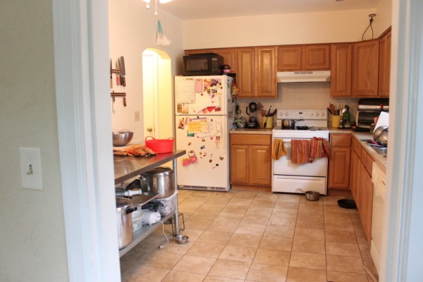
There's one place in our house that I haven't dared to write about yet - the dysfunctional kitchen. It's an ugly space we use often. The back door to the house, the entrance we use most often, walks right into this room. Each time we host a dinner party or undertake a large preserving project, the 'heart of the home' reveals more design flaws. I could go on for days about what's wrong with our kitchen but I won't bore you with all the details. Instead, in the spirit of Friday Five, here are the basics of what we dislike most:

1) Where's the other half? Our kitchen is spacious but only has counters and cabinets on two of the four walls, which leaves us lacking in storage and working space. We temporarily corrected the issue with a large stainless steel table from a restaurant supply store. But why, when there is a perfectly good dining room just through the doorway, did someone not install cabinets on all four walls?

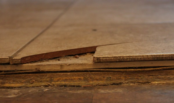
2) The ugly, ill-installed, tile floor - Tile is an abomination in a working kitchen. The hardness breaks every glass and dish that is dropped. It feels cold and bounces sound. Cold + hard = achy legs when processing a mountain of fruit, stock, or vegetables. Ours happens to have been installed by someone either inexperienced or lazy enough to not fully clean off the grout, so we have swipes of now-hardened grout on top of the tiles that collect mud and look dirty at the drop of a hat. On the upside, despite the five (!) layers of flooring, they all seem to be degraded enough that tearing them out won't be much of a problem.

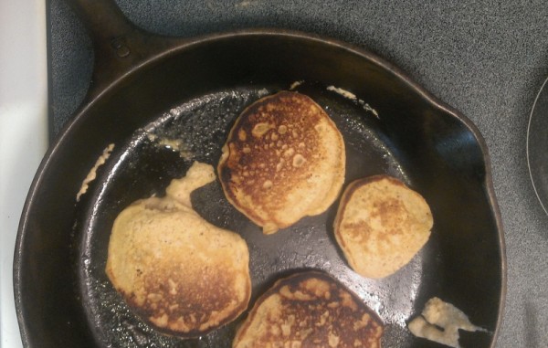
3) The glass-top electric range - I could write a book about how much I despise electric, glass-topped ranges. Instead, how about if I list the things I could easily cook six months ago but now are either underdone or burnt or both every time I make them: popcorn, quesadillas, pancakes, eggs, bacon, grilled cheese. In what I think is an oft-repeated design flaw, this range has the controls on the back of the unit, requiring the cook to reach across steaming pots of water to turn down the heat.
4) Recirculating exhaust fan - Recirculating exhaust fans, the kind that most kitchens have attached to a microwave or just above the range, are worthless. They do nothing to remove heat or steam or smoke from the area. We'll have to move the range to the other wall to install an outside-venting fan but this is the only way that baking and canning in the summer is bearable to me.

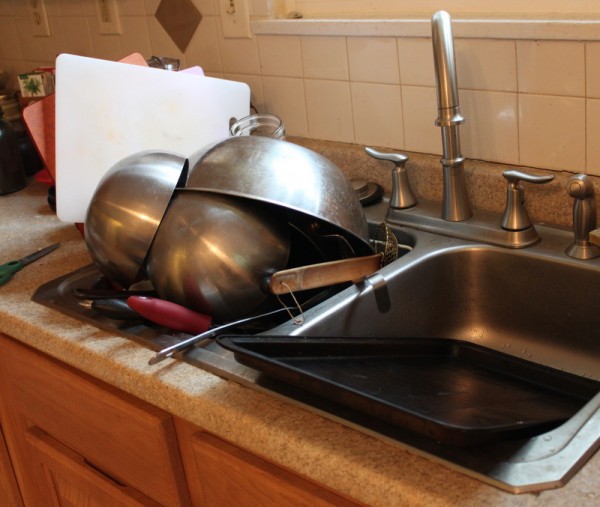
5) The too-shallow sink - Our kitchen has a standard two basin ten-inch deep sink. Our needs, apparently, aren't standard because many of our pots didn't fit under the faucet until we replaced it with this number chosen for height. Our biggest cookie sheet doesn't fit width wise. There are always clean dishes spilling out of the drying basin. Large cuts of meat are nearly impossible to rinse and yes, we're still cure-deep in charcuterie. A deeper sink like my beloved old numerar doesn't take up much more space and is imminently more useful.
I feel a little guilty whining about a kitchen that many people around the world would love to cook in. Truly, we could live with this design and these appliances for many years if we needed to. But my aching legs tell me that if we're going to happily preserve the (hopefully) hundreds of pounds of food that we're growing, we could use an upgrade.
Fortunately we're starting to plan a DIY kitchen renovation. Did you know this blog started out documenting the renovation of our last kitchen? We've actually taken kitchens apart and put them back together in our two previous houses, so we're well aware of the effort the project will require. We'll document the process along the way and ask for your opinions too. Because while we're quick to solve the functional issues, we could use help with the finishes and designer-y options.
What bugs you about your kitchen?
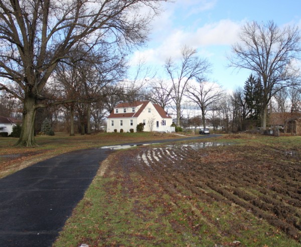
 On the first day of winter 2013, central Ohio was subject to flood watches. Our property developed two temporary ponds and two whole acres of mud as several inches of rain melted four inches of snow. One of the ponded areas is where we plowed about a quarter acre of lawn for planting next year. The plan is to till it and fill in low spots with additional soil when the land dries but does not freeze. We may be waiting until spring for that chore.



 . The row of metal teeth is meant to perfectly separate sour grapefruit segments from thin, bitter membrane. More frequently in our house, the teeth scrape the insides of harvest orange winter squash.